 知识的殿堂
知识的殿堂Appearance
基础组件
空状态 Empty
此为全局注册组件
参数说明
| 参数 | 说明 | 类型 | 默认值 |
|---|---|---|---|
| image | 提示图片 | string | OSS_COMMON_IMG + 'empty.png' |
| description | 描述文字 | string | 暂无数据 |
按钮 Buttons
标准按钮
对应设计稿中的【标准按钮】,可直接使用AButton,在此基础上拓展了类型。
使用说明
由于设计稿中对于按钮的类型已经做了定义,在对照AntD的定义后,重新整理type。具体结合设计稿和下方表格进行对照
比较特殊的一个,设计稿中的删除按钮使用时按照AntD的危险按钮添加danger属性,并设置type为primary即可。
| 设计类型 | type |
|---|---|
| 主要按钮 | primary |
| 次要按钮 | default |
| 描边按钮 | stroke |
| 文本按钮 | text |
| 连接按钮 | connect |
| 企业级按钮 | enterprise |
文本按钮 TextButton
此为全局注册组件
对应设计稿中的【文本按钮】,同时支持超链接和router-link属性
html
<TextButton type="dark" :to="{name: 'MiniprogramVisitorDetail', params:{id: record.openid}}">
    {{ record.nickname }}
</TextButton>

<TextButton href="https://www.baidu.com" target="_blank" type="danger" size="small" loading>Baidu</TextButton>
参数说明
| 参数 | 说明 | 类型 | 默认值 |
|---|---|---|---|
| size | 尺寸 | default large small mini | default |
| type | 颜色类型 | default dark danger | default |
| icon | 图标name | string | |
| to | 是否通过router-link跳转 | object | |
| disabled | 禁用状态 | boolean | |
| loading | 等待状态 | boolean |
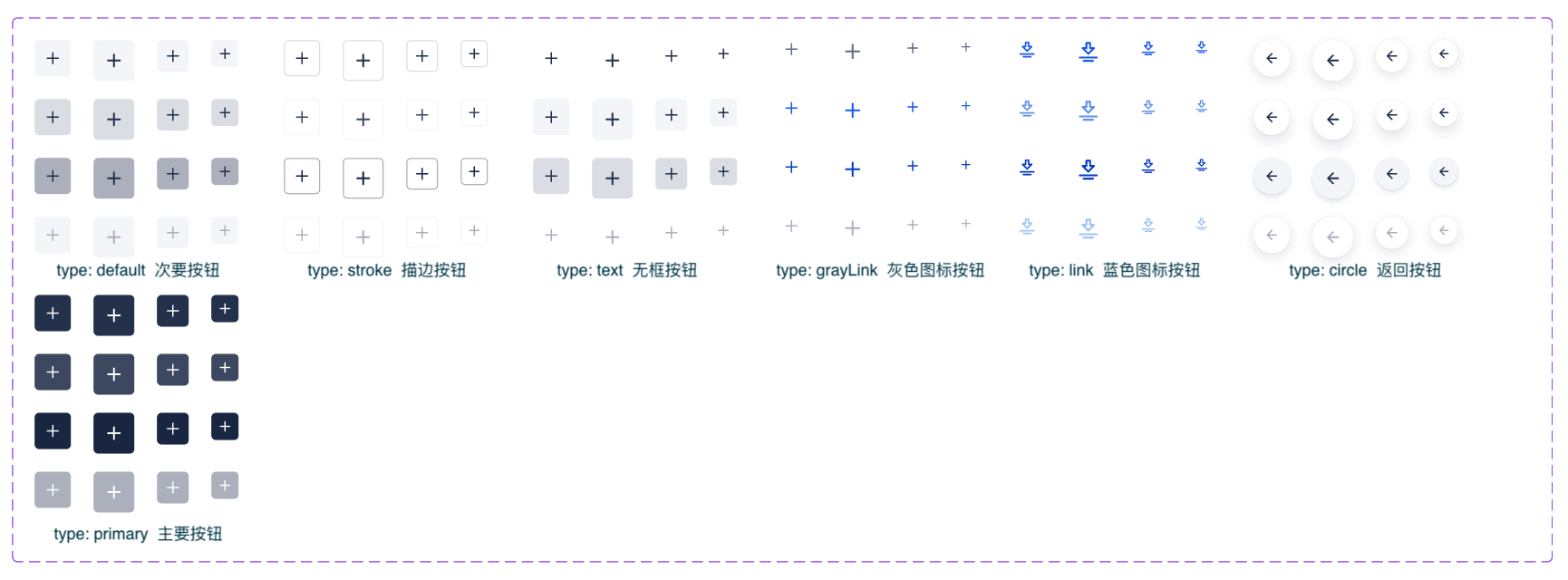
图标按钮 IconButton
此为全局注册组件
基于TextButton和a-button封装,对照设计稿图标按钮使用
html
<IconButton title="下载" type="circle" size="small" icon="download-2" @click="downloadReport(record)"></IconButton>参数说明
未提及的参数说明同TextButton
| 参数 | 说明 | 类型 | 默认值 |
|---|---|---|---|
| icon | 图标name | string | |
| title | tooltip title | string | |
| type | 按钮类型,类型对照参考下方图片 | default stroke text grayLink link circle primary | default |
| customClass | 自定义类名 | string |
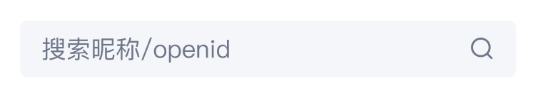
InputSearch
此为全局注册组件
由于AntD的Input.Search实现效果与设计稿差距较大,改造困难,故在Input基础上二次封装InputSearch组件
API
其余参数和事件与AInputSearch一致,在此基础上拓展了回车触发search事件的功能。
| 参数 | 说明 | 类型 | 默认值 |
|---|---|---|---|
| light | 是否使用白色背景 | boolean |
html
<InputSearch v-model:value="params.k" placeholder="搜索昵称/openid"
                     @search="getVisitorList"></InputSearch>
补充
设计稿中小部分搜索使用白色背景,添加类white即可
FilterSelect
此为全局注册组件
⚠️ 虽然加了 $attrs,但是 a-select 的部分 api 可能会有些问题,使用时需要注意
支持
a-select的插槽写法仅支持 单选
API
未提及的参数及事件同 a-select
| 参数 | 说明 | 类型 | 默认值 |
|---|---|---|---|
| name | 筛选器的名称 | string | |
| value(v-model) | 当前选中的条目 | string | |
| options | options 数据,如果设置则不需要手动构造 selectOption 节点 | array<{value, label, [disabled, key, title]}> | |
| addAll | 是否需要自动添加 "全部" 配置项 | boolean | true |
| defaultSelectAll | 是否默认选中 “全部”配置项 | boolean | true |
| allValue | “全部”配置项对应的 value 值 | string | all |
| fieldNames | 自定义节点 label、value 的字段 | {label: string, value: string} | {label: 'label', value: 'value'} |
| light | 是否使用白色背景 | boolean |
RangePicker
使用方法同a-range-picker,该组件对设计稿中的分隔符和图标等进行了替换,同时对没有确定按钮的情况进行了处理,在面板关闭时触发事件,暂时可等价为确定按钮的点击事件。
javascript
import RangePicker from '@/views/components/common/RangePicker.vue'html
<RangePicker v-model:value="range" :allow-clear="false" @openHide="emits('change', range)"></RangePicker>Tag标签
ColorTag
DotTag
vue
<template>
  <DotTag type="success">已审核</DotTag>
</template>
<script lang="ts" setup>
  import DotTag from "@/views/components/tags/DotTag.vue"
</script>
参数说明
| 参数 | 说明 | 类型 | 默认值 |
|---|---|---|---|
| size | 尺寸 | default large small | default |
| type | dot类型 | danger warning success info fill | - |
StatusTag
vue
<template>
  <StatusTag type="success">已审核</StatusTag>
</template>
<script lang="ts" setup>
  import StatusTag from "@/views/components/tags/StatusTag.vue"
</script>
参数说明
| 参数 | 说明 | 类型 | 默认值 |
|---|---|---|---|
| size | 尺寸 | default large small | default |
| type | 状态类型,主要影响icon和颜色 | failed warning success processing info default | default |
| icon | 自定义icon,颜色跟随type,未指定时跟随type里的图标 | string |
IconRadioGroup
vue
<template>
  <IconRadioGroup
      :options="[Position.left, Position.right]"
      v-model:value="value.content.style.logo.position"></IconRadioGroup>
</template>
<script lang="ts" setup>
  import DotTag from "@/views/components/common/IconRadioGroup.vue"
</script>
参数说明
| 参数 | 说明 | 类型 | 默认值 |
|---|---|---|---|
| value | v-model:value | Key | |
| options | 提供的选项 | { label: string, value: Key, icon?: string }[] |
OptionalSelect
根据参数可以控制渲染radio还是checkbox,可以用来代替radio-group或checkbox-group
vue
<template>
    <OptionalSelect
        v-model:selectedValues="selectedValues"
        :multiple="multiple"
        :value="item.memberId">
        <img :src="item.thumb_avatar" alt="" width="32" class="rounded-full mr-3 ml-2" />
        {{ item.name }}
    </OptionalSelect>
</template>
<script lang="ts" setup>
    import OptionalSelect from "@/views/components/common/OptionalSelect.vue"
</script>
参数说明
| 参数 | 说明 | 类型 | 默认值 |
|---|---|---|---|
| multiple | false渲染radio,true渲染checkbox | boolean | false |
| selectedValues | 选中的key | Key[] | |
| value | key | Key |